At first, I couldn't even tell you what I wanted the final kitchen to look like. So to peg down what I really wanted, I started just browsing photos of beautiful kitchens online. I stumbled upon the website Houzz.com (soon to become my favorite). Here, designers post photos of their spaces. I loved that I could "favorite" photos and organize them in a scrapbook. After doing this for quite some time I was able to look back over my favorites and establish a pattern of what I liked: Dark wood floors, classic white cabinets, shiny black counters, maybe a little marble, some chrome for bling, and white backsplashes, all with simple clean lines and pale, cool-colored walls.
Some of my initial inspiration photos collected on Houzz.com
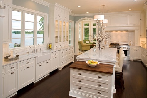 |
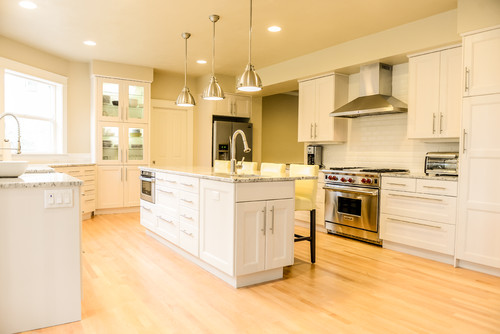
| My tastes range from elegant... I love the pendants over the island, the chrome details, and the crown moldings. Photo: Wayzata Architects & Designers Alexander Design Group, Inc. |
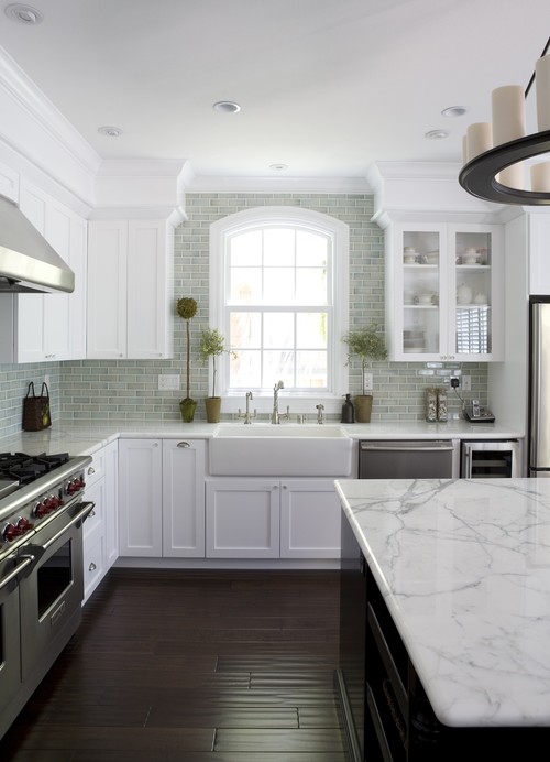 |
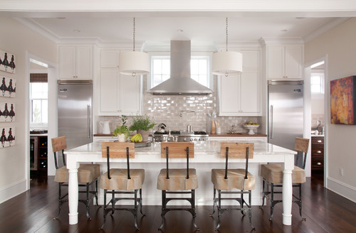
| ...and classic... I like this photo for the dark handscraped floors, the farm sink, and the marble counters. Photo:San Francisco Interior Designers & Decorators Fiorella Design |
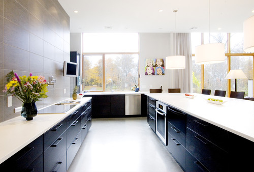 |
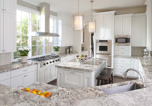
| ...to surprisingly modern! I can't put my finger on it exactly, but I want to live in this kitchen! While very different from the other photos, it still has the clean lines and the dark and light contrast. Plus I love the drum pendants. Photo: Boston Architects & Designers Chang + Sylligardos Architects |
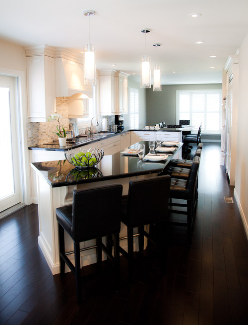 |
The glass pendants make this a more contemporary kitchen. Actually, I might call this Transitional. Still love those black shiny countertops.
|
With a more concrete idea of the look I wanted to achieve, I took a tip from the real designers and started building a sample board. My first sample board had a sketch of the floor plan, some elevation drawings, a sample of black shiny quartz for the counters, and a collage made from kitchen cabinet pamphlets with exact kinds of materials available at the local home improvement stores. Notice how the collage has dark wood floors, white cabinets, a black countertop, and stone backsplash.
With my husband having won the cabinetry debate, we agreed on the solid wood Ramsjo style cabinetry from Ikea in white. On one of our various trips to Ikea we bought a single 12x12 Ramsjo panel door. This way we could take the panel with us while shopping for tile, paint, etc. and know that the colors and textures would play well together (or not!)
I say "or not" because what I quickly learned with the Ramsjo "white" is that it actually looks pinkish in some color combinations. Some colors bring out the pink undertone and others do not. This is because the panel is made of birch wood and the white paint is more of a whitewash. If we really wanted, we could paint the door fronts. Lots of people do this to achieve a custom color, but this was an added expense we were hoping to avoid and sort of defeats the purpose of saving money with Ikea door fronts in the first place.
I initially wanted a marble or travertine backsplash, but against the Ramsjo door the marbles looked too blue and all the other stones looked too yellow. I was not happy with the color combinations at all, but had really fallen in love with the simple Ramsjo panels and wasn't ready to give up on them.
Back to the drawing board! Browsing for more inspiration photos, I noticed that I gravitated toward kitchens that had gray, pumice, or taupe accent colors.
 |
My first sample board made in Spring 2012 (Yes! That's right! I made it before we even closed on the house!)
|
With my husband having won the cabinetry debate, we agreed on the solid wood Ramsjo style cabinetry from Ikea in white. On one of our various trips to Ikea we bought a single 12x12 Ramsjo panel door. This way we could take the panel with us while shopping for tile, paint, etc. and know that the colors and textures would play well together (or not!)
I say "or not" because what I quickly learned with the Ramsjo "white" is that it actually looks pinkish in some color combinations. Some colors bring out the pink undertone and others do not. This is because the panel is made of birch wood and the white paint is more of a whitewash. If we really wanted, we could paint the door fronts. Lots of people do this to achieve a custom color, but this was an added expense we were hoping to avoid and sort of defeats the purpose of saving money with Ikea door fronts in the first place.
 |
| A simple, but beautiful kitchen featuring Ikea's Ramsjo white cabinetry. Photo: Contemporary Kitchen by Eugene Design-build Firms John Webb Construction and Design |
I initially wanted a marble or travertine backsplash, but against the Ramsjo door the marbles looked too blue and all the other stones looked too yellow. I was not happy with the color combinations at all, but had really fallen in love with the simple Ramsjo panels and wasn't ready to give up on them.
Back to the drawing board! Browsing for more inspiration photos, I noticed that I gravitated toward kitchens that had gray, pumice, or taupe accent colors.
Second round of inspiration kitchens from Houzz.com
 |
| After figuring out that I wasn't going to be able to do a white or stone backsplash, I moved on to the idea of a pale taupe in shiny field tile. Photo: Wayzata Architects & Designers Alexander Design Group, Inc. |
 |
| Getting more realistic: A more modest kitchen, closer to what mine might look like. I love the designer pendants, but would rather they be chrome than gold. My husband also liked the look and feel of the kitchen, so we're getting closer! Photo: Traditional Kitchen by Ellen Grasso Design, LLC |
Somewhere along this process I stumbled upon the fabulous website Olioboard.com. The website allows you to create virtual sample boards. It lets you design and mock up a room and see what it will look like before you buy anything! You can search for items by keyword, or import photos of the products you want to try. Plus, the website is extremely user friendly. I was able to figure out how to mock up my kitchen in minutes without the help of their tutorial.
 |
| A sample board of our Kitchen Renovation created on Olioboard.com. I found all the pictures by searching for specific products online. The mock up helps me envision how the final kitchen will look. |
So off to the Tile Market to find something unique and beautiful. (Since realizing that the "Surface Materials" category was the most important to me, I decided that I could splurge a little here!) I needed the experts at Tile Market to help me with both flooring and a backsplash. Many of the inspiration kitchens with which I had fallen in love had wood floors. I really yearned to mimmick this look, but there were two problems. First, all the wood flooring in our home is original. It's beautiful and something I want to continue to preserve, but the kitchen is one of the few places where it no longer exists. The kitchen had a black and white checkered tile pattern when we bought it. Through demolition we discovered that the tile had been laid over a combination of "harvest gold" linoleum, particle board, and some of the original flooring. Thus, there was not enough of the original floor in the kitchen that it could even be salvaged and restored. The only way to have wood flooring in the kitchen would be to lay down a new one. I knew that it would be impossible to match the original floors in the adjacent dining room and throughout. Butting up new flooring next to old did not set well with me. Plus, as much as I love the look, warmth and give of a wooden floor underfoot, tile is much easier to clean and will withstand more traffic.
I still wanted to achieve the look of a wooden floor, so I looked at the faux wood tiles that have recently flooded the home improvement stores. I thought that if I chose a tile that looked like wood, but was a drastically different color, I could still get the look I wanted and then it wouldn't look so out of place next to the original wood floors. My husband disagreed. "If you want the look of wood, get wood! Faux wood tiles look tacky and will look dated sooner." And that's when I discovered the Ragno Revision tile from Italy (of course!)
 |
| Ragno Revision porcelain tile flooring in alternating bands of brown and black. Photo: Floor Tiles by Sterling Heights Tile, Stone & Countertops World Class Tiles |
Ragno's Revision tile has all the characteristics I was looking for. It's not intended to look like real wood quite in the way that most faux wood tiling does, but it has a slightly textured surface, giving it the look of an old worn floor. I decided on the "black" tile color as seen in the photo above, but take my word that if you put this tile next to something that is truly black you'll see that it's really a very dark brown color instead. In fact, we've chosen to use black grout to further emphasize the dark brown quality of the tiles. The tile color isn't flat either; there are actually strokes of black and brown mixed together. The variation in color gives it a warm look and feel. I think it will help to hide dust and dirt more than a solid color would. But it still has a high lusterous surface! I love the slightly glossy sheen. This tile is just what I wanted. To create the look of wood I chose 12''x48'' tile planks, which we'll lay with a 1/3 alternating offset.
The backsplash tile was harder to narrow down. I couldn't find anything that mimicked the kitchens in the second round of photos. Buying the beautiful, but high end Walker Zanger tiles, or getting custom color-matched hand-made tiles from Portland, was out of our budget (again!) Plus, there was another problem. Now that I had chosen a non-black, non-wood flooring material, it wasn't going to look right with my shiny black quartz countertops. The reps at Tile Market pointed out that the combination of black-brown + pinky white + black + who-knows-what-else-backsplash-color was becoming too much and would not look well planned. So my black quartz countertops were out.
"Hmm. It doesn't seem like we're making progress here. I can decide on one product, but then I have to get rid of another. I'm not getting anywhere! Alas, the selection of one product produces a domino effect!"
I proceeded to spend my Spring Break on a shopping mission for backsplash tile and countertops. I have now visited so many tile stores and kitchen supply companies that if you need info, I've probably got it! Out of desperation, I made the long drive to Floor&Decor Outlet.
Must. Exhaust. Every. Possibility.
Must. Exhaust. Every. Possibility.
I absolutely couldn't believe it when I found a beautiful taupe subway tile there on clearance. Granted, it was darker than I initially wanted, and I would have preferred a 3x6 size instead of 4x8. But it was the right shape, the right tone (not too purple, not too brown, not too gray) and at $0.89 a piece, you couldn't beat the price. I did the math. I was going to save so much on my backsplash budget with this stuff that I could upgrade to designer lighting! Sold! I bought every box they had right off the shelf.
Now all I had left to do was find a countertop. Looking back over my inspiration photos I noticed that I really gravitated toward marble countertops. I love the look and cold feel of marble. But I am also picky and prefer very white marbles with large crystals and very little veining. The popular carrera marble is too grey for me. Plus, I lived with a marble countertop in my Riverside apartment and there is a marble vanity in our second bathroom now. I know first hand how hard it is to keep it looking pristine. Marble etches when it is exposed to acids. Even if it's sealed it is not 100% protected. And it has to be constantly resealed. Honed marble makes the inevitable etching less noticable, but the trade-off is that the material is more porous. It will soak up colors and oils like a sponge. Spill some red white on your honed or untreated marble countertop? Congratulations - you now have pink marble countertops! I know from experience that I am just not disciplined enough to care for marble countertops. And while the etching and staining doesn't really bother me all that much, I fear others would just think I'm dirty. As great as the stone is for making pasta and pastries, sadly, I don't think marble countertops will work for us.
Granite was out of the question, too; not just because it is more of an upgrade than what our neighborhood will realistically supports, but more so because I think it is too pedestrian and passe. Everybody has granite these days. I want something different. Plus, most granites have a lot of color and crystal variation. Everybody raves about how no two granite slabs are the same, but to me this just means I'm not exactly sure what I'm going to end up with when it's installed. I'd rather buy something more predictable and I really don't want so much color.
Quartz became the easy decision for me. I love that it is cold like marble, but heat/crack/stain resistant like granite. Plus, it never needs to be sealed. And because it is a man-made stone, I feel more confident that the product I select based on a small sample will look like I expect it to in the end. Some quartz brands have very recently come out with a style that appears to have veining like marble, but I'm not quite sold on this yet.
Lady luck must finally be on my side because with the help of the lovely consultant, Donna, at First Coast Kitchen Supply I found Caesarstone's "Atlantic Salt" -- a white quartz with flecks of taupe/gray that compliment the backsplash tiles I found on clearance.
Finally, to round out the color palette, I allowed my husband to offer his interior design skills and pick out a cool grey paint from Sherwin Williams. I hate the name ("Alpaca"), but bought a sample quart and threw it on half the old kitchen walls before demolition. Then I placed all the other samples next to it and I have to admit I fell in love!
After making the final selection of materials, I came across this photo on Houzz.com. With the exception of the floors, I think this might foreshadow what my kitchen will look like. It's not at all what I initially set out to create, but I love the color combination that we've chosen and cannot wait to see the finished product!
Now all I had left to do was find a countertop. Looking back over my inspiration photos I noticed that I really gravitated toward marble countertops. I love the look and cold feel of marble. But I am also picky and prefer very white marbles with large crystals and very little veining. The popular carrera marble is too grey for me. Plus, I lived with a marble countertop in my Riverside apartment and there is a marble vanity in our second bathroom now. I know first hand how hard it is to keep it looking pristine. Marble etches when it is exposed to acids. Even if it's sealed it is not 100% protected. And it has to be constantly resealed. Honed marble makes the inevitable etching less noticable, but the trade-off is that the material is more porous. It will soak up colors and oils like a sponge. Spill some red white on your honed or untreated marble countertop? Congratulations - you now have pink marble countertops! I know from experience that I am just not disciplined enough to care for marble countertops. And while the etching and staining doesn't really bother me all that much, I fear others would just think I'm dirty. As great as the stone is for making pasta and pastries, sadly, I don't think marble countertops will work for us.
Granite was out of the question, too; not just because it is more of an upgrade than what our neighborhood will realistically supports, but more so because I think it is too pedestrian and passe. Everybody has granite these days. I want something different. Plus, most granites have a lot of color and crystal variation. Everybody raves about how no two granite slabs are the same, but to me this just means I'm not exactly sure what I'm going to end up with when it's installed. I'd rather buy something more predictable and I really don't want so much color.
Quartz became the easy decision for me. I love that it is cold like marble, but heat/crack/stain resistant like granite. Plus, it never needs to be sealed. And because it is a man-made stone, I feel more confident that the product I select based on a small sample will look like I expect it to in the end. Some quartz brands have very recently come out with a style that appears to have veining like marble, but I'm not quite sold on this yet.
Lady luck must finally be on my side because with the help of the lovely consultant, Donna, at First Coast Kitchen Supply I found Caesarstone's "Atlantic Salt" -- a white quartz with flecks of taupe/gray that compliment the backsplash tiles I found on clearance.
Finally, to round out the color palette, I allowed my husband to offer his interior design skills and pick out a cool grey paint from Sherwin Williams. I hate the name ("Alpaca"), but bought a sample quart and threw it on half the old kitchen walls before demolition. Then I placed all the other samples next to it and I have to admit I fell in love!
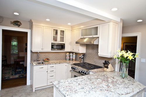
 |
| Our surface materials, shown here in natural day light: "White" Ramsjo cabinets (Ikea) "Alpaca" paint color (Sherwin Williams) "Arrow wood" Brites Series, field tile (Interceramic) "Atlantic Salt" quartz countertop (Caesarstone) "Black" Revision Series, porcelain tile (Ragno) |
After making the final selection of materials, I came across this photo on Houzz.com. With the exception of the floors, I think this might foreshadow what my kitchen will look like. It's not at all what I initially set out to create, but I love the color combination that we've chosen and cannot wait to see the finished product!
 |
| Now we're getting down to my size of house! Is this what my future kitchen will look like? Photo: West Hartford Design-build Firms Kitchen + Bath Design + Construction, LLC |
So now I want to hear from you. If you've designed your kitchen, did you go through the same agonizing process of selecting materials? Did it turn out just as you imagined?
Hi - I just had my cabinets installed and the Ramsjo pink issue did not show itself until we put the appliances back. They are white and it's not in my budget to make a change. I also have a white quartz countertop on the way. I am now considering having the doors painted - i'm not sure what or how I will deal with the trim. I had started with a grey paint (purple undertone) on the walls but after reading your post, I'm wondering if that is making the cabinets pinker. What colors did you find minimize that impact? I should be happy that my kitchen is redone but the color issue has me pretty down at this time.
ReplyDeleteHi, Lauren! We had the same issue with the pink undertone becoming more noticeable once everything else was in. Have you tried changing the light bulbs yet? It won't get rid of the contrast completely, but it might minimize the difference. We have LEDs in our drum pendants (general lighting) right now and halogen bulbs in the pot lights (task lighting). They each make the ramsjo white look different. As for the paint, I felt like anything with a warm color (red, orange, yellow, pink) made the pink look worse. Blues & greys can go either way. IMO greens, browns, purples (cool colors and secondary colors) seem to compliment the ramsjo more. We have Sherwin Williams "Alpaca" on our walls. It's a very neutral color with undertones of grey, taupe, and lavender. I would definitely get quart samples to test on the walls, and be sure to see what it looks like in both daylight and at night. Look also for more kitchens with Ramsjo white (try ikeafans.com or houzz.com) to see what other peope have done and what looks good to you. The colors I ended up with are not at all what I originally imagined. Keep in mind you can change the appliances over time, and not necessarily all at once either. We could only afford a new range in the end, but black and stainless both go well, and we plan on updating overtime with more stainless. Even though my eye still picks up the "pink" color, all my guests always say, "What pretty white cabinets!"
DeleteWe're in the middle of installing a white Ramsjo kitchen. I knew it was pink, and decided to work with it: so far, so good! Walls are painting BM Alabaster, which is a white with hints of pink that looks great with the cabinets. Oddly enough when I sit the Farrow & Ball Pink Ground paint chip against the cabinets, it's almost the same colour as well. Ain't colour fun.
ReplyDeleteFloors are white oak with a Rubio Monocoat finish (old-fashioned mix of linseed oil and beeswax - looks amazing, and smells nice too).
Countertops were going to be cherry butcher block or slate, but now the floor is finished I'm reconsidering white oak, red oak, or walnut butcher block instead, as the grains are better with white oak than cherry is.
I just placed my order for Ramsjo white cabinets in a total kitchen re-do. We are downsizing and renovating an entire (small) house before we move from our large one. BEFORE sealing the deal on the Ramsjo cabs I had the walls completely repainted in SW Rice Grain, which looks good in the house but may be a bit too "warm" for the kitchen. I panicked. Our GC--who has a great eye for color--calmed me down and reminded me that almost 95% of the kitchen will be cabinetry, counter, backsplash, or appliance--there is very little painted area showing. He told me to go with LED lightbulbs, and check the color tones; make sure my trim pieces (of which there are a couple strips on a corner edge) are not Decorator White, and wait until the cabinets are in before selecting a counter and backsplash tile.
ReplyDeleteAs someone else mentioned, WE are seeing the pink tones, but everyone else is just noticing a beautiful, warm, and inviting (not hospital sterile) white kitchen.
I posted the above ^^ and now here it is 5 months later, the cabinets are in. They look great--but they are PINK. The problem is twofold: 1) there are no windows in the kitchen and the natural lighting is indirect, coming through sliding glass doors in another room, 2) The cabinets appear whitish at first glance, but only for a millisecond, when one's eye notices where the cabinets meet the ceiling. The ceiling is Glacial White. So the contrast makes the cabinets look even more pink.
ReplyDeleteThe answer I have come up with is to paint the ceiling. I used SW Rice Grain (taupish-green) on the walls, but forgot to tell the painters to thin Rice Grain by 1/2 and use it for the ceiling. Hence, they put stark white on the ceiling--ick.
The other consideration is the lighting, or lack thereof. What light does come into the kitchen is from a backyard patio with lots of greenery and filtered blue sky. So it is sickly, dim light, kind of the color of old fluorescent bulbs. I'm thinking of putting in an overhead skylight. When I have taken the cabinet doors to another location, i.e. close to a window or outside, they do not appear pink at all, they look really nice. ,
Liz,
ReplyDeleteGreat block. I am with John Webb Construction & Design LLC and I really appreciate you giving us credit for the picture used. We have had a lot of issues with people using our images without any credit. I would love to chat about your blog briefly if you ever have time. John Webb Construction & Design LLC scott@johnwebbs.com
Great and easy-to-understand tutorial, thnx!
ReplyDeletemarble exporters in india.
Hi!
ReplyDeleteI hope you are still accepting comments. I think that these designs are great but you never get the full impact of the tile unless you physically touch it and see it live.
Tiles truly can dynamically change a room and working with a local supplier is your best option.
website
Its really great post you have shared, which is informative. I appreciate your great work.
ReplyDeleteSmall Kitchen Remodeling Designs
Kitchen Design Layout
Small Kitchen Remodeling Designs
Kitchen Design Cabinets
Complete Kitchen Remodel
Just added some pet-safe plants to my space after reading Coach Pets.
ReplyDeleteHTMC Group stands as one of the top manufacturers of minerals in India, known for delivering high-quality mineral products across diverse industries. With a commitment to excellence and innovation, HTMC offers a wide range of minerals that meet global standards.
ReplyDeleteSolid advice here—have you seen home renovation projects? -->
ReplyDeleteThis comment has been removed by the author.
ReplyDeleteThis was a really helpful read! We recently upgraded to Custom Kitchen Cabinets in our home, and the warmth they bring to the space is unmatched. Thanks for sharing these valuable tips!
ReplyDeleteThanks for sharing these ideas about using marble in interior design.
ReplyDeleteMarble kitchen countertops Ireland
Luxury kitchen design Ireland
Irish marble kitchen installers
Modern kitchens with marble Ireland
Premium kitchen renovation Ireland
Marble kitchen suppliers Dublin
High-end kitchen companies Ireland
Natural stone kitchen surfaces Ireland
Custom marble kitchens Ireland
Interior design marble kitchens Ireland
Thanks for sharing these ideas about using marble in interior design. Marble kitchen worktops Ireland
ReplyDeleteLuxury marble kitchens Dublin
Custom marble countertops Ireland
Marble kitchen design Cork
Bespoke marble kitchens Ireland
Natural stone kitchen surfaces Ireland
Marble kitchen suppliers Ireland
Elegant kitchen interiors Ireland
Marble and granite kitchens Ireland
High-end kitchen renovations Ireland
The reality of a kitchen goes beyond its visual appeal, focusing on functionality, efficiency, and daily practicality. While beautiful countertops and stylish cabinets are attractive, a truly effective kitchen must support everyday tasks like cooking, cleaning, and storage. Limited space, clutter, and worn-out appliances can challenge even the most organized cook. Real-life kitchens must balance aesthetics with durability and ease of maintenance. Smart layouts, proper lighting, and accessible storage are essential. Whether small or spacious, the true value of a kitchen lies in how well it serves the needs of its users, blending comfort, utility, and a touch of personal style.
ReplyDeletehttps://avahome.pk/
Just wanted to say thanks for this post! I’ve been overwhelmed trying to find a Custom Kitchen Cabinets I can trust. Your tips made the process feel much less stressful. Appreciate your guidance and all the helpful examples you included!
ReplyDeleteHello, I simply would like to give you extensive thumbs up for the phenomenal information you've got here about this post. It is a helpful and informative post. Thanks for sharing this great information.
ReplyDeleteIKEA kitchen installer
Black kitchen sink granite in delhi - Nice blog, thank you so much for sharing with us.
ReplyDeleteI think black cabinets never go out of trend; they always look stylish and timeless.
ReplyDeleteblack bathroom cabinets
Your process of turning inspiration into reality is so relatable! The way you balanced beauty with practicality, especially in choosing the Ragno Revision tile, was really smart. It reminded me of how VDF Flooring Contractors in Hyderabad also focus on combining design vision with durability when working on projects. Loved reading your journey—it shows how much detail goes into building a dream kitchen!
ReplyDeleteUpgrade your cooking space with stunning granite kitchen countertops. Known for their durability and natural beauty, they’re the perfect blend of style and strength for any home.
ReplyDeleteIf you are looking for the best kitchen design and built in design. I will recommend you the glendorakitchen
ReplyDeletebest wooden matches
ReplyDeletecustom match boxes wholesale
wooden kitchen matches
wooden safety matches
custom safety matches
Granite sinks - Your post is very great.i read this post this is a very helpful.
ReplyDeleteYour detailed journey from inspiration to execution is so relatable! Anyone planningkitchen remodling can learn a lot from how you balanced aesthetics with practicality. The tips on selecting cabinets, tiles, and countertops are especially helpful for creating a dream kitchen that works in real life.
ReplyDeleteGreat post! I really appreciate the way you explained everything so clearly. The insights you shared were genuinely helpful and easy to understand. I especially liked how you highlighted the key points with practical examples. Looking forward to reading more content like this from you. Keep up the excellent work!
ReplyDeleteroof inspection service norwalk
Many homeowners rely on kitchen remodeling contractors in Seattle to ensure high-quality workmanship and efficient project management.
ReplyDeleteLove the transformation process. Great way to plan out every detail. If you’re also thinking about durable, easy‑to‑maintain flooring that works beautifully with kitchen designs, Tremix flooring Contractors in Hyderabad offer smooth, long‑lasting options that complement modern and classic layouts alike.
ReplyDeleteThanks for sharing these ideas about using marble in interior design.Irish interior design trends
ReplyDeleteluxury kitchen countertops Ireland
granite and marble suppliers Ireland
custom kitchen installations
EU construction and design standards
high-end residential projects Ireland
natural stone craftsmanship
modern kitchen renovation Ireland
local marble companies
sustainable stone sourcing Ireland
Premium kitchen faucets - Your post is very great.i read this post this is a very helpful.
ReplyDeleteLoved reading your journey from inspiration photos to the final kitchen decisions—it feels so real and relatable! The way you balanced style, budget, and practicality is inspiring. Your choice of materials, especially the splash tiles for kitchen, really adds character and warmth.
ReplyDeleteHelpful content It’s true that investing in quality kitchen faucets can make daily kitchen work much easier.
ReplyDeleteVery informative! Professional installation ensures safety. Check kitchen exhaust installation in Sterling Heights MI.
ReplyDelete